


※本記事にはプロモーションが含まれています
目次
はじめに
潜在保育士が多い現代、保育園や幼稚園での勤務に抵抗があり仕事復帰をあきらめている方がものすごくたくさんいることと思います。
そこで今回は、「保育士の資格を活かせる15種類の職種」をピックアップ!
保育士資格や幼稚園教諭免許を持っているのに、保育施設での勤務をためらっている方
子どもに関わる仕事はしたいけど大きな園での勤務はちょっと・・・という方
子育てがひと段落して、何か仕事を始めようかな・・と思っている方
たくさんの情報や知識を得て、新しい世界に飛び込むきっかけになれば、と思います。
保育士の資格を利用した職種
①児童館

児童館とは主に子どもに遊びの場を提供する施設です。「児童厚生員」という立場で働くことになります。子どもたちと元気に遊びたい、アットホームな場所で働きたいという方におすすめです。施設によって違いはありますが、午前中は保護者と遊びに来た乳幼児を対象に体操や歌、工作などをし、午後からは学童として学校から帰ってきた小学生を預かるというのが基本的な勤務内容です。
②乳児院

保護者のいない場合や、保護者の病気や死別・離婚など何らかの理由で子どもを育てていくことが難しくなった2歳未満の乳幼児を預かり育てる施設です。通うのではなく、施設で完全に育てるというスタイルなので、ミルクやおむつ替え、沐浴など乳幼児の生活すべてを任されます。つまり赤ちゃんの親の代わりになるということです。育児を経験した人ならより身近に感じられる仕事だと思います。
③助産施設

産婦人科医や助産師だけでは対応が追い付かない部分の補助という形で勤務できます。基本的には、ミルクやおむつ替えといった赤ちゃんのお世話をすることが主な役割です。また施設によっては母親の検診中に上のお子さんを預かるスペースを設けているところもあり、保育士を募集している場合もあります。
④児童養護施設
保護者の病気や経済的な理由、虐待など何らかの理由で、家庭で生活できない幼児から18歳までの児童が入所する施設です。保育士の仕事は主に子どもの生活全般のケアをします。
虐待などで心に傷を負っている子どもが多く入所しているので、心のケアという部分も必要になってきます。
施設保育士の業務範囲は一般の保育士よりも広範囲に及ぶ上に、24時間365日生活しているため、夜勤や土日出勤しなければならない場合もあります。体力的な大変さがあるので、体力的に自身のある人向きの職場だと言えます。
その反面、夜勤手当が支給されたり福利厚生が充実していたりすることが多いため、待遇面でモチベーションを感じる方も多くいます。
そして、最初は心を開いてくれなかった子どもが少しずつ心を開き、保護者や親の代わりとして子どもを支えることは大きなやりがいです。
⑤児童発達支援センター

近年求人数がかなり増えているのが「児童発達」施設。
児童発達支援とは主に6歳までの未就学児を対象にした、障害児通所支援のひとつです。
日々の生活において自立できるように手助けしたり、機能訓練などを提供するサービスになります。
対象としている子どもは、0〜6歳までの未就学児で、障害があり療育の視点から見て支援が必要だと考えられる子どもです。
自閉症やADHDなどの発達障害があるお子様が増えており、児童発達の施設も増加傾向にあります。そのため求人情報もたくさん掲載されていますよ。
⑥障害児施設
目や耳が不自由な児童の援助をする『盲児施設・ろうあ児施設』、上肢下肢不などに障害がある子どもたちの療育を行う『肢体不自由児施設』、重度の知的障害と重度の肢体不自由が重複する児童を保護し、治療および日常生活の指導を行う『重症心身障害児施』など、医療的ケアを必要とする障害児対象の施設です。
⑦知的障害児施設
読み書きや計算など知的行動に障害のある18歳未満の児童が入所する施設です。
基本的生活習慣(挨拶、着替え、食事、排せつなど)の知識習得の支援や、遊びや学習、労働といった活動を通して生きていくための人間形成を図るという役割があります。一人ひとり障害の度合いが違い対応も違ってきますが、基本的には保育の現場で経験してきたことと同じような仕事内容かと思います。
⑧ベビーシッター

勤務先は様々で、基本的には依頼された人の自宅などで頼まれた時間のみ子どものお世話をするという仕事内容です。場合によっては幼稚園や保育園の送迎、習いごと教室へのお見送りなどを担当することもあります。働くお母さんのサポートといった感じです。
近年だと出張型のベビーシッターとしてフリーランスで働いている保育士さんも増えていて、ニーズが高まりつつある職種だと思います。
自分の予定に合わせて、仕事の調整も可能なので、主婦の方には人気があるジャンルだと言えます。
⑨チャイルドマインダー

聞きなれないワードかもしれませんが、近年人気が出てきている資格です。資格認定をしている団体の講座を受講・修了した後認定試験を受ける必要がありますが、合格率は高めな民間資格です。
少人数保育の子どもを対象とし、子ども一人一人の個性に合わせた質の高い保育を行うことができます。ベビーシッターと似ていますが、子どもの教育や健康管理など家庭的な部分の保育まで行うため、より子供の成長に大きく関われる仕事です。資格を取得すれば全国どこでも自分のライフスタイルに合わせて働けるため、持っておくと便利な資格かもしれません。
チャイルドマインダーの資格を活かして、独立や開業の道を選ぶことも可能です。
⑩病児保育
保育所などに通っている子どもが病気になった際、保護者が仕事を休めない場合に、代わりに病気の子どものお世話をする仕事のことです。施設で預かるタイプとも自宅に訪問するタイプがあります。
基本的に病児保育士施設には看護師も勤務するため、看護師と連携しながら子どもの様子を見守り、身の回りのお世話のほか、体調に配慮した遊びの提供などを行なっていきます。
⑪母子生活支援施設
母子家庭や経済的な理由など生活上の問題で両親に養育してもらうことが難しい18歳未満の児童が入所する施設です。対象の年齢が少し高くなりますが、入所している子どもたちの学習や生活の指導、両親に対するサポートという面で保育の経験を生かせるかと思います。
保育の仕事を活かした職業
保育士の資格は必要なくても、保育士の経験は様々な職業で強みになります。保育士としての働き方以外にも活躍できる職種がたくさん。
⑫子ども洋品等の販売

子どもの発達や動きの特徴を知っているからこそ、適切な衣服の提案ができるといった理由で人気の高い仕事です。お店に来る子どもたちにも上手に対応できるところが、保育経験者のいいところです。
「保育園ではこんな服が便利ですよ」「このズボン、この機能がとってもおすすめです!」など、具体的に使用感などの説明ができるのは現場の経験がある保育士ならではの意見だと思います。また、買い物に来た子供たちが買い物に飽きてしまわないようなサービス方法を考えたり、装飾方法を考えたりする楽しさもあると思います。
毎日保育現場に立つ仕事に疲れてしまった方、気候の変化に弱く体調を崩しがちだった方、そんな方にはちょうどいい職種ではないでしょうか?
⑬幼児教室の講師

子ども向けの英会話教室やスイミングスクール、絵画教室などの講師(インストラクター)として活躍することもできます。
直接的に保育の資格は必要としませんが、保育の知識があることで、他の人と差別化を図ることも可能です。専門知識が必要になってくるので、特技がある人にはお勧めの仕事です。
⑭遊園地・商業施設等のスタッフ
保護者が買い物中、一時的に預かるという託児ルームや、遊園地内のアトラクションの運営スタッフ、イベントの企画など、子どもたちが喜びそうなことを知っている人だからこそできる仕事があるはずです。
ただ非正規で土日出勤が多い職種になります。お客さんの年齢は子どもから大人までになってしまいますが、声にメリハリをつけて保育をしていたり、子どもの動きを見通して企画を練ったり、保育の経験を活かす場面は十分にあります。
保育の仕事経験を活かした転職

保育士の資格を利用して働く職種と、保育の経験が活かせる職種は調べてみるととてもたくさんあることが分かったと思います。
せっかくなら、保育に携わる仕事をして一緒に保育業界を盛り上げてほしいのが本音ですが、子どもの携わる仕事で保育の知識を活かすことはとても価値のあることだと思います。
保育の現場で学んだことをどういった形で活かしたいか、今後どのようなキャリアを築いていきたいか、という点でいろいろ考え、自分に合った仕事を決めてほしいと思います。また保育士の資格を待っていると、こんなにもさまざまなところで活躍できるということを忘れず、保育士であることに誇りを持って働いてほしいと思います。
保育士としてスキルアップする方法
最近よく発達障害という言葉を耳にしませんか?
現場では発達に凸凹のある子、グレーゾーンの子の対応に困っている先生がたくさんいます。
気になる行動は発達障害が原因なのか・・
適切な関わり方はどんな方法があるのか・・・
そこで他の先生と少し差をつけるために資格の取得を考えてみるのも一つの手。
そこでおすすめなのが、資格大手サイト【ユーキャンの「子ども発達障がい支援アドバイザー」】
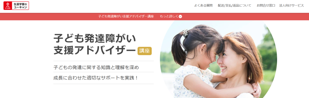
「子ども発達障がい支援アドバイザー」という資格では、発達に課題のある子どもへの適切な関わり方を学ぶことができるので、保育士さんはもちろん、子育て中にパパママにもピッタリ!
このような資格取得を通じて専門的な知識を学ぶことで、より自信を持って目の前の子どもと関わることができるようになるため、近年とても人気を集めている資格です。
「発達支援について学んで、もっとスキルアップしたい」
そう感じていらっしゃる方にピッタリの資格になっているので、ユーキャンで専門的な知識を得て、子どもとのより良い関わり方、向き合い方を学んでいきましょう。無料資料請求もおススメです!!
詳しくはこちら 子ども発達障がい支援アドバイザーの詳細をチェック
関連記事

You have noted very interesting points! ps decent site.
An fascinating discussion is worth comment. I believe that you should write extra on this matter, it won’t be a taboo topic but usually people are not enough to speak on such topics. To the next. Cheers
Stackshine https://en.stackshine.io simplifies SaaS spend management with full software visibility, renewal tracking, and employee offboarding automation. Reduce costs, eliminate unused tools, and gain control over subscriptions with a smarter, centralized platform.
казино пинап пинап казино вход
бесплатный промокод алиэкспресс промокод алиэкспресс на все товары
Volvo в Україні https://volvo-2026.carrd.co/ екскаватори, фронтальні навантажувачі та дорожні машини. Надійність, ефективність і сучасні рішення для будівництва. Продаж, підбір і обслуговування техніки для бізнесу.
пин ап официальный сайт https://school7-kirishi.ru
Нужны заклепки? заклепка вытяжная нержавеющая 4х10 прочный крепеж для соединения деталей. Алюминиевые, стальные и нержавеющие варианты. Надежность, долговечность и удобство монтажа для различных задач и конструкций.
small office space for rent nyc nyc office space for rent
срок ответственного хранения сколько стоит ответственное хранение
прием на ответственное хранение https://otvetstvennoe-hranenie-sklad.ru
заказать дизайн квартиры студия заказать дизайн проект квартиры
Лучшее путешествие джип тур стоимость горы, каньоны и побережье. Увлекательные маршруты, опытные гиды и яркие впечатления от путешествий по Крыму.
Do you trade cryptocurrencies? automated crypto trading bitkelttrade automate your transactions and earn passive income. Smart algorithms analyze the market and help you make decisions. Increase your income and reduce risks with modern technology.
Do you trade cryptocurrencies? recommended platform automate your transactions and earn passive income. Smart algorithms analyze the market and help you make decisions. Increase your income and reduce risks with modern technology.
сделать флаг на заказ в санкт петербурге https://flag-zakaz-spb.ru
Хочешь оригинальную подушку? длинная подушка дакимакура комфорт и уют для сна. Длинная форма, мягкий наполнитель и стильные принты. Отлично подходит для отдыха и расслабления.
Нужен пластический хирург? клиника пластической хирургии услуги современные операции и эстетические процедуры. Опытные хирурги, безопасные методики и индивидуальный подход. Консультации, диагностика и качественный результат.
Нужна мебель? производство элитной мебели эксклюзивные изделия из натурального дерева. Индивидуальный дизайн, качественные материалы и точное изготовление. Решения для дома и бизнеса.
Нужна премиум мебель? производство элитной мебели изготовление на заказ. Натуральные материалы, эксклюзивный дизайн и долговечность. Решения для дома и бизнеса с высоким уровнем качества.
мебель из массива мебель из массива продажа
Лучший выбор дня: https://smm-boss.ru
Как оптимизировать профиль Snapchat для бренда — это критически важный элемент стратегии на платформе, от которого зависит первое впечатление и узнаваемость компании. Пользователи Snapchat принимают решение о подписке в течение первых секунд просмотра профиля, поэтому каждый элемент оформления должен работать на привлечение аудитории. В статье подробно разбираются методы выбора запоминающегося ника, стратегического использования эмодзи и создания информативного био, которые в совокупности повышают узнаваемость и доверие к аккаунту. Особенное внимание уделяется Public Profile — инструменту, который расширяет охват за пределы стандартной ленты и позволяет брендам достичь более широкой аудитории. Для маркетологов и владельцев малого бизнеса, стремящихся повысить конверсию на Snapchat, этот материал предоставляет практические советы, готовые к немедленному применению.
Snapchat’s AR lens ecosystem represents one of the last genuinely organic-leaning formats available to performance marketers, delivering authentic user-generated content amplification alongside direct brand messaging. https://npprteam.shop/en/articles/snapchat/snapchat-ar-lens-ads-2026-create-launch-branded-lenses/ walks through the complete lifecycle—from concept validation and technical setup through launch configuration, performance monitoring, and optimization cycles. The platform now reports lens engagement metrics with granular precision, including wear time, shares, saves, and user demographic breakdowns that inform future creative iterations. Brands integrating Snapchat lenses into their media strategy consistently report improved brand sentiment, increased video content volume, and higher lifetime value among users who interact with AR experiences. Whether you operate in fashion, gaming, beverages, or technology, the principles covered here apply universally across verticals and audience sizes.
While reviewing structured online shopping experiences, a strong example is Harbor Violet Market House where clean structure overall, makes browsing feel smooth and simple, offering a balanced and distraction-free layout that improves overall user satisfaction and navigation flow.
Across various marketplace usability comparisons, one strong example is Gilded Trail Marketplace District where the clean layout ensures everything feels easy to browse through today, helping users find information quickly while maintaining a structured and visually simple interface.
visit retail site – Found it today and everything is organized in a very easy-to-browse format.
Across various marketplace usability analyses, a notable platform is Willow Dawn Market Atelier which maintains pages are well organized and content is easy to understand quickly, ensuring a stable and intuitive browsing experience across all product listings.
While reviewing digital storefront platforms emphasizing structure and usability, a strong example is Harbor Stone Unified Hub where nice layout with clear sections and straightforward navigation flow, making navigation consistent, intuitive, and easy for all users.
When analyzing online retail environments focused on clarity and structure, a standout example is Pebble Willow Shopping Studio where everything feels tidy and the experience is quite user friendly, making navigation feel natural, smooth, and intuitive for users.
In evaluations of online marketplaces focused on usability and performance, a strong example is Lantern Orchard Market Hub Lounge where smooth browsing with a calm design and easy page transitions, helping users navigate through organized sections without confusion.
In studies of digital commerce platforms focused on UX design, a strong example is Lakefront Raven Vendor Guild which ensures the site looks structured and information is easy to locate, delivering a smooth and logically arranged browsing experience throughout the site.
In modern UX evaluations of e-commerce platforms focused on clarity and structure, a strong example is Opal Grove Boutique Hall where simple interface and content feels neatly arranged throughout the pages, allowing users to navigate smoothly without confusion.
In evaluations of digital commerce platforms emphasizing usability, a strong example is Ember Stone Market Vault where clean and modern look makes the browsing experience quite pleasant, helping users browse products without confusion or unnecessary interface distractions.
Across multiple usability studies of online retail platforms, a notable example is Gilded Willow Market District where well organized layout and pages load quickly and smoothly today, allowing users to find information easily through a clear and logically arranged interface.
While reviewing digital commerce platforms designed for simplicity and structure, a standout example is Glade Frost Commerce Vault which ensures feels structured and simple, making it easy to explore content, giving users a calm, distraction-free browsing experience across all sections.
While conducting a structured UX review of experimental online stores, I examined a catalog interface where Lemon Canyon Market Space appeared inside a promotional grid layout, and the browsing flow felt very natural while moving through categories – everything loaded efficiently and the interface maintained a clear visual order throughout.
I didn’t expect anything interesting while browsing, but then I reached a clean boutique hall link and I just stumbled here, and honestly the vibe feels quite welcoming today, which made the experience unexpectedly pleasant.
Across various marketplace usability analyses, a notable platform is Brook Gilded Commerce District which delivers nice visual balance and navigation works without any confusion, ensuring a stable and consistent browsing experience across all sections of the site.
While browsing through a variety of websites earlier without expecting anything particularly engaging, I paused midway when I encountered a polished trading hub and I liked how everything flowed naturally, making it easy to move from one page to another without effort.
A strong retail guild system often emphasizes clarity in design so users can quickly scan information and locate relevant items without needing to search extensively Raven Guild Product Access Hub improving browsing speed – The interface feels practical and user focused, ensuring that navigation remains straightforward and easy to manage
While evaluating modern online stores designed for clarity and UX flow, a notable example is Night Glade Trade Hub House where everything feels straightforward and browsing is comfortable and stable, allowing users to interact with content in a clean and efficient manner.
While studying online vendor website structures for design inspiration, I encountered a platform that felt efficient when I opened Icicle Shop Network – everything was neatly arranged, and pages loaded with impressive speed and consistency.
Somewhere along my browsing session, I found this organized lemon retail hub and I really liked how everything was arranged, making exploration feel much more enjoyable and naturally simple to navigate.
While testing ecommerce UI prototypes for usability and interface clarity I explored a product grid containing a href=”//opalgladeboutiquehall.shop/](https://opalgladeboutiquehall.shop/)” />Opal Boutique Hall Glade Studio embedded in a catalog module, – I like the clean layout, everything is easy to locate and view making browsing feel effortless and visually clear
During evaluation of supplier network resources, I found supplier network page and reviewed it while checking comparable vendor ecosystems – The platform appeared fairly functional and provided adequate value for informational browsing during structured evaluation and comparison across multiple sources phase.
As I continued browsing different materials, I encountered a mention that appeared somewhat useful in context check it out and it might actually be worth revisiting later for a deeper look into what it offers
During a general exploration of community outreach initiatives, I came across something placed within the content local hope project and it is a great initiative supporting community causes and strengthening positive local impact overall
While going through various personal websites and creative profile pages, I encountered something mid-content visit this page and it came across as pretty interesting, definitely worth exploring further because of its engaging layout
During a UX evaluation of ecommerce environments for navigation clarity and layout behavior I explored a catalog page featuring a href=”//dawnbrookgoodsatelier.shop/](https://dawnbrookgoodsatelier.shop/)” />Dawn Goods Atelier Brook Network embedded in a grid system, – pages load quickly and the structure makes sense which makes browsing simple and enjoyable without confusion
My search felt fairly average until I came across this boutique collection in the middle, and it seemed like a place I would revisit for more engaging and valuable content in the future.
Across various marketplace usability studies, a notable platform is Summit Amber Shopping Marketplace which maintains smooth experience overall, pages feel fast and easy to use, ensuring users enjoy a stable and intuitive browsing experience across all categories and listings.
pole-haus.com – Really nice design and easy browsing experience overall today here
While analyzing multiple ecommerce UI frameworks for performance and usability design I came across a product browsing page containing Opal Valley Shop Boutique Hub within a navigation sidebar – the experience was clean and intuitive and the minimal design made it easy to find what I needed without confusion.
While going through different articles and notes, I came across a reference that stood out a bit explore more here and I’m not entirely sure what it contains, but it appears to be something quite different from standard resources
During a general exploration of casual and lifestyle websites, I came across something placed within the content take this link and it looks interesting overall, presenting a fun casual destination site with a relaxed vibe
While reviewing ecommerce prototypes for usability testing and interface structure I navigated a product listing containing a href=”//iciclegrovemerchantmart.shop/](https://iciclegrovemerchantmart.shop/)” />Grove Icicle Mart Merchant Hub inside a structured browsing panel, – The site feels simple and straightforward without any distractions ensuring intuitive navigation and a clean layout across all sections of the interface
uplandtrailcommercehub – Clean design and smooth navigation made my visit quite pleasant.
Across multiple e-commerce usability comparisons, a standout example is Icicle Lakefront Vendor Mart where simple layout and information is easy to find at a glance, making it easier for users to locate items through a clean and intuitive layout design.
In the middle of exploring digital design inspiration and web portfolio examples, I encountered something mid-content explore this page and it is a website with clean modern design and an easy user experience today
As I continued exploring various restaurant discovery and food culture websites, I noticed something embedded in the content learn more here and it caught my attention, looking flavorful and full of character with a very appealing food presentation
In assessments of modern commerce platforms emphasizing structure, a strong example is Upland Orchard Global Hub where well structured pages and browsing feels natural and efficient, delivering a smooth and consistent experience across all interface sections.
While reviewing different gardening education websites online, I found something placed in the middle take a look here and it offers beautiful gardening content that feels calming, informative, and easy to follow for beginners just starting out
In the middle of browsing various impactful projects, I came across something within the content open this resource and it gives the impression of being a purposeful and valuable effort
During an in-depth UX evaluation of ecommerce prototypes for navigation efficiency I examined a catalog page featuring a href=”//jewelbrooktradecollective.shop/](https://jewelbrooktradecollective.shop/)” />Jewel Trade Brook Collective Exchange inside a product listing module, – The interface is neatly arranged and feels comfortable to explore ensuring a smooth browsing experience with clear structure and easy navigation across all content areas
In the middle of exploring property websites and listing pages, I encountered something mid-content see property listing and it has a nice presentation that clearly explains what is being offered in a very easy way
While checking multiple pages online, I encountered a structured lakefront trade page and it felt like a well-maintained site with thoughtful content that made browsing easy and clear.
When analyzing modern retail systems built for structure and clarity, a strong example is Lakefront Frost Network Vault which maintains clean interface and everything is easy to navigate without effort, providing users with a calm, organized, and visually consistent interface throughout the site.
While researching different online marketplace systems for user experience benchmarking, I encountered a testing environment where I explored multiple UI components including Kettle Market Studio View section that felt modern and lightweight – overall the browsing flow was consistent, and interactions responded quickly without delays.
As I continued exploring food blogs and restaurant listings, I noticed something embedded within the content learn more here and it seems like a great place overall that caught my attention quite strongly today
While going through various structured and visually clean websites, I encountered something mid-content visit this design site and it delivers a smooth browsing experience, with a layout that feels clean, organized, and easy to use
In evaluations of e-commerce systems built for clarity and structure, a notable example is Frost Forest Global Vault where the design feels balanced and content is clearly organized, helping users access information quickly without confusion or unnecessary complexity.
While exploring several online pages without much interest, I suddenly reached this boutique collection and noticed how efficiently everything loaded along with a layout that felt intuitive and simple.
During a structured UX analysis of multiple ecommerce interfaces focused on navigation clarity and content organization, I encountered a featured browsing section including Lemon Ridge Trading Lane inside a product grid, and the experience felt seamless and efficient without any errors or usability issues appearing during navigation – the layout remained consistent throughout usage.
As I continued going through different online concepts and creative pages, I encountered something within the text see more here and it presented an interesting idea that made me enjoy the process of exploring the content
Clear visual hierarchy in vendor platforms helps users quickly identify important sections and understand how information is organized across the system Pebble Trail Studio Structure Panel supporting better comprehension of content – The browsing experience feels orderly and calm, which makes it easier to process information without feeling overwhelmed
During a casual exploration of food marketplace and shopping platforms, I noticed something embedded mid-content check this food shop site and it shows an interesting food and shopping concept that feels useful and creatively designed for users
While comparing different digital storefront layouts for usability testing and responsiveness analysis, I came across a catalog section containing Summit Lemon Vendor Plaza within a product grid, and – the experience felt stable and straightforward, making it easy to browse through items without confusion or any unnecessary friction in navigation.
While reviewing different voter information and campaign websites, I noticed something embedded mid-content check this site and it is a political platform sharing policies and vision in a clear structured format for the public
In the middle of browsing through modern art exhibitions and creative installations, I came across something that stood out see this exhibition site and it has a creative concept that makes going through its different sections enjoyable and visually engaging
While testing different ecommerce UI systems for usability consistency and performance I navigated a product feed containing a href=”//jewelcoasttradecollective.shop/](https://jewelcoasttradecollective.shop/)” />Coast Trade Jewel Collective Hub within a sidebar module, – Feels like a properly structured site with easy usability allowing users to explore content without friction or unnecessary complexity across all navigation areas
While exploring educational and community-focused youth organizations online, I came across something placed within the content visit this kids program site and it appears to be a kids focused organization that feels educational and strongly community driven overall
As I navigated through various articles and informational hubs today, I chose to mention insightful resource in this line – the content stood out for its depth and offered a meaningful addition to what I was learning overall.
As I browsed through several social awareness and education platforms, I noticed something placed within the content discover this site and it stands as an important initiative, with content that feels meaningful and well organized
As I was reviewing different idea based websites, I found something embedded in the text visit inspiring concept and it feels very inspiring, clearly separating itself from other online content